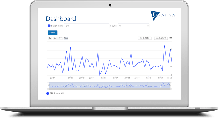
We are pleased to announce the public launch of a newly designed website for Strativa, our management consulting firm focused on independent advice for business and technology decisions.
Free Resources
In addition to giving the site a fresh new design and new content, one of our motivations was to be able to offer free resources for download to our website visitors. A starting collection is now online:
- The Need for Independence in Advisory Services: An informal video interview by Frank Scavo on the history of Strativa and the value of independence.
- Business Strategy Case Study–The Critical Few: A case study from one of our business strategy client engagements, where the client achieved outstanding financial results.
- VAR to Solution Provider: Strategies for Business Transformation: A research report providing an example of our thinking around business strategy.
- Elevating the Role of the CIO: A research report on how CIOs can elevate their role within the organization to take the lead on innovation.
- Trends in ERP and How to Ensure Success: A 10-minute video presentation highlighting current trends in ERP adoption and key factors for success.
- The Whats and Whys of the IT Service Catalog: A research report from Strativa Practice Director Wayne Meriwether, giving a primer on the basics of IT service catalogs.
These are just the start. We plan to add to this collection over the coming months.
Design Principles
The new site was designed by Streetwolf, a digital creative studio in Los Angeles. Click the link to see some of the major brands its developers have worked with. They designed the new site with three key principles:
- Responsive design: The site is written in HTML5, featuring responsive design. If you’re not familiar with that concept, it means that the site detects whether you’re running on a desktop, tablet computer, or smartphone, and automatically adjusts to optimize viewing on that device. If you’re viewing the site on a desktop or laptop, you can see the responsive design in action, by taking your browser out of full screen mode and dragging the window more narrowly. You’ll see the site automatically adjust to the new size, and at some point you’ll see the menu bar shrink down to a “hamburger” (those three horizontal lines indicating a menu is behind it).
- Readability: The site is content-rich, focusing on the primary services that Strativa offers. It also includes a blog. With so much content, the site is designed for readability, from the font choices to the color palette. The text is primary. Images are spare and serve to illustrate the content, not overwhelm it.
- Fast: No one likes to wait, especially when looking for information and especially when viewing a site on a mobile device. Images are compressed and we deploy caching of website content where appropriate to optimize the site for fast performance.
If you have feedback on the new site, please let us know through the Strativa contact page.

